Friday, 30 March 2012

Final Poster

Initial photos
This was the initial design that I had for my poster as it fitted my target audience; middle aged men and women. My main aim was to show love. However, I think this looks very awkward and far to cramped. I really wanted the main focus to be the femme fatale but because I wanted her looking at detective Jack Chandler she was lost.

I then tried to reposition everyone and to get the femme fatale to sit down however I fount this made James Harold look more dominant. Although here I muc prefer the positioning of everyone as it is like they are in order. However there is nothing to suggest love between the detective and femme fatale. At this point I was starting to think that I would have to think of a new plan where love was still shown but there was no connection between the characters.


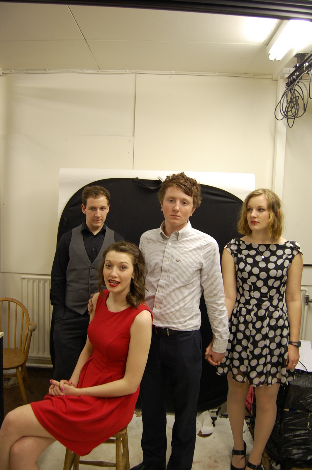
I tried to reposition the characters one more time but yet again I found that the focus was on James Harold and not on the femme fatale. Here she is really not dominant like she should be. However I do like the fact she is holding Jame's hand. I found it really hard to show the confussing love triangle that appears in the film.


I took these two back up shots so that if I needed to think of a new plan whilst editing I would have pictures of just the femme fatale this will help me make he look dominant. I also added the feather boa which I thought makes he look more sexy/seductive as the dress doesn't show any clevage.
I can also use all of these photos for my film review I particular think that the feather boa pictures would be appropriate.

Developing ideas
After studying all the photos I have decided that I really don't like the photos where all the characters are in holding hands and looking at each other. I think that they look very awkward and a bit confussing. I have therefore decided that I will use the second image of the femme fatale and hopefully using the other images cut out each character and place them so that the love triangle can still be seen. Luckily I am quite epxerienced with photoshop and this is something that I am able to do however, from past experience this process will take a while.
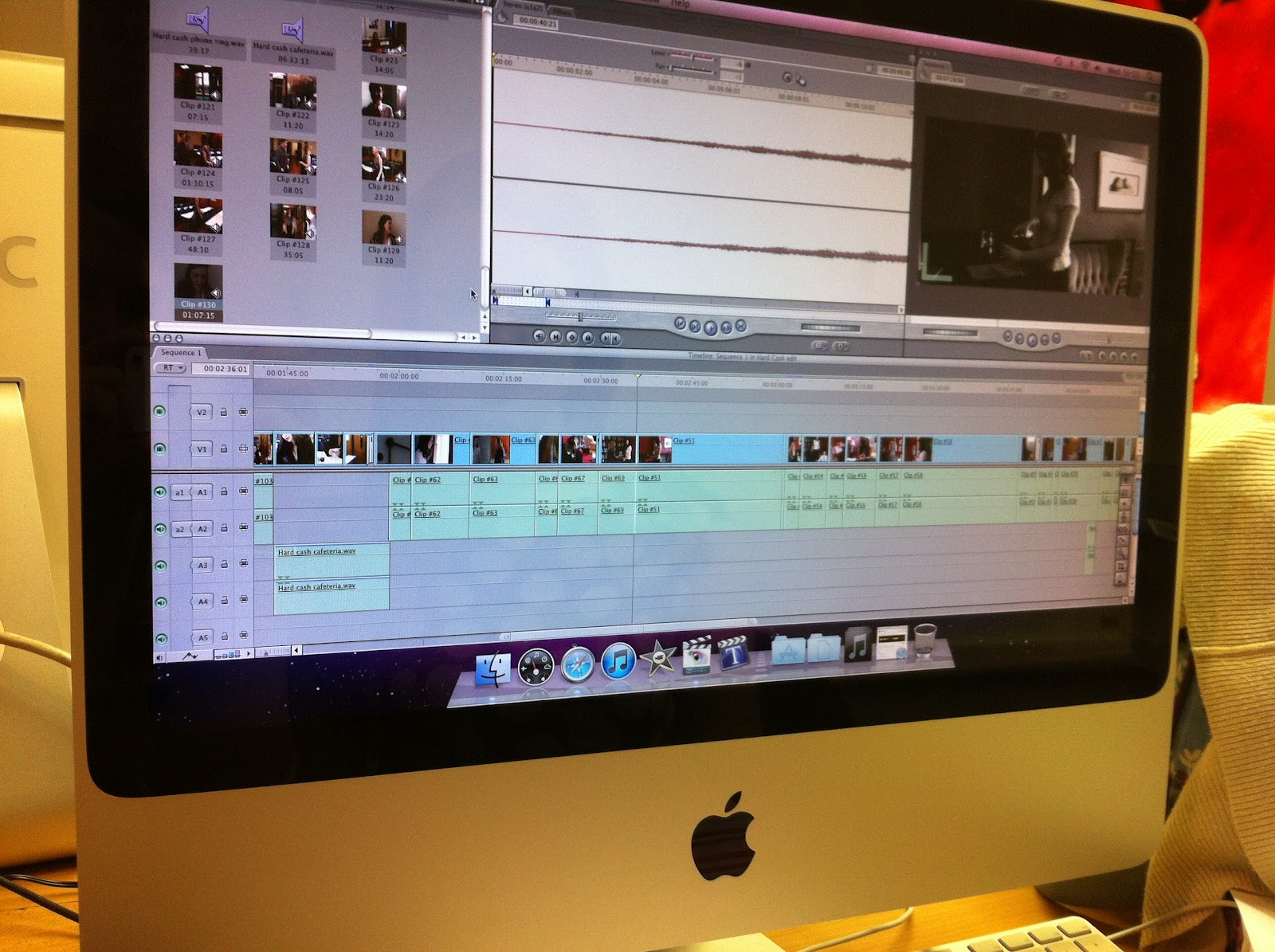
Edited images
As you can see I have edited all the characters together, I used the single photo of the femme fatale and then I was able to cut out each character from a photo with all the characters in, I have put it all on a black background as I think this is suited to the film noir/noe noir genre.
I have then editied this image on photoshop to adjust the tone, I think however this is a very dark image due to the image and would not stand out which is really essential. However, it has created some good lighting which is a typical film noir convention.


This is my favourite edit, I think it is really effective and will stand out well. The femme fatale is definantly the main focus and the red is a very common film noir convention. As well as this I think the feather boa adds a sexy/seductive side to the femme fatale. Although I did have to change my design I think that it has improved and still shows love effectivly so will still appeal to my target audience.

The next step to creating my poster is to add all the text. I did this using an online software as there are a lot more fonts avaliable. I needed to make sure my fonts suit the film and compliment the poster.

Final Poster

I am really happy with my final poster although it was more complicated than I expected to edit, I think that this is very effective. It fits my target audience and shows love which was my main aim. I have decided to put a dollar sign as the 's' in the title as I think it looks effective and adds another dimention to the poster.

Tuesday, 27 March 2012

Audience feedback planning

What have you learned from your audience feedback?
This is the third question for the evaluation, I have decided that I will film interviews with people from different target audiences asking them a set of questions about film noir the genre and about our film Hard Cash. After filming the interviews I want to film myself responding to the audience feedback so that I can answer the question effectively. I have written these questions to ask each person:

Before watching Hard Cash:
Do you know a film noir is?
Would you watch a film noir?
What film noir features would appeal to you?

After watching Hard Cash:
After watching Hard Cash do film noirs appeal to you more?
What did you like about Hard Cash?
What didn't you like about Hard Cash?
Was it auitable for your age range?
Would you recommend Hard Cash to a friend?
How could we improver Hard Cash?
How would you rate Hard Cash out of 5 (1- being poor and 5 - being excellent)

Sunday, 25 March 2012

Hard Cash

This is our final film noir, Hard Cash:
http://www.youtube.com/watch?v=jL_C8tbdZzc&feature=youtu.be

We upload our video to YouTube a popular video uploading website on the 22nd of march it is now the 25th march and our film has had over a 100 views. I am so happy and proud about how many views we have one person even commented: "Class! A stunning debut by all involved. 10/10" I just hope that people carry on watching our film, Hard Cash and enjoy it as much as we did creating it!

At the start of this YouTube clip you can also see our final production company logo which we created on Final Cut. We did originally want the clapper board to slam shut and then the film starts however this was not possible to do in the short amount of time that we had. We therefore choose to add sound to the text to make it more hard hitting and interesting to the viewer.

ENJOY!

Brick Film Review

After writing a film review for L.A. Confidential which is a film noir, I decided to write one for Brick a neo-noir. I have used some of the same concepts and wording. All of this is in preperation for writting my own film review for Hard Cash.
From start to dramatic finish, the plot of Brick is constantly thickening and always changing. First time director Rian Johnson sets a hard-boiled thriller in the drappled light of a southern california high school. Bricks concept should not work; unconvincing teenagers, investigating crimes and dealing drugs, acting like adults but somehow Rian Johnson has made it believable and really suitable for the audience. Brick isn't just a great movie; its an amazing deconstruction of the neo-noir genre. Brick is a neo-nior this is a modern version of film noir, and is often in colour.  Neo-niors contain fim noir features. Brick is a 2005 American neo-nior film written and directed by Rian Johnson. The title regers to a block of herion compressed roughly to the size and shape of a brick.
The characters twist and turn in the wind so much that you are not sure who to trust. Well except main character Brendan (Joseph Gordon-Levitt). Brendan chases down the clues to find out who killed his ex girlfriend. Although he appears weak and timid he will stop at nothing to find the truth.
The lonely teenager Brendan finds his former girlfriend Emily in the entrance of a sewage tunnel and recalls her phone call two days ago, when she she said to him that she was in trouble. Brendan, who still loved Emilt, met bad elements of his high-school trying to contact her, and when he succeeded she told him that she was ok. He then starts to investigate hermurder, investigating the meaning and concepts of two words; Brick and Pin. Using the support of his nerd friend Brain, he succesfully meets the small drug dealer Laura (Nora Zehetner) and Tugger (Noah Fleiss), to reach the teenage powerful drug dealer The Pin (Lukas Hoas).
Slowly Brendan unravels the motives of why Emily was killed and plots a revenge.

Monday, 19 March 2012

The Big Edit

After four weeks of editing, we have finally finished our Film Noir - Hard Cash! This has been very time consuming and has become our main priority, and so we have not been posting regular blogs. Instead we have decided to make one big post about editing as a whole. Therefore this post will be a write up of our editing process.

Week 1 (20th February - 24th February)
We began by uploading all of our footage from the camera's and watching them all. We sorted out the good shots from the bad and then put them in order of appearance in our movie. We also made sure that we were capable in using Final Cut on the Mac computers, for example, how to make our clips black and white and how to make scenes fade in and out. However, we found that this came quite naturally because of the previous experience we had acquired while making our Music Video for Example - Change the way you kissed me, at the end of our AS year.
Although we had started editing, we had some filming left to do. We filmed on the 22nd February in school, for the cafeteria scenes. By this point, we had already edited scene one and two, including music.
We edited both scenes by carefully watching each shot again, and selecting specific sections from the clips and placing them in the time line. We then had to make sure that the scene flowed together well and was easy to watch, to do this we had to remove some shots that we liked, or change the order of them slightly. For example, in scene two we changed the order of the kissing and the close up of the hand shot. This scene had a lot of different sections and angles, and so probably took us the longest to edit.
As we went along, we made each completed section (apart from the coloured Neo Noir scenes) black and white, which made it easier to see which scenes we had completed when we came back the next day. To make it black and white, we selected the whole scene, went to 'Effects', 'Video Filters', 'Image Control' and then 'Desaturate'.
Because we didn't have the footage for 3 and 4 uploaded, we went on to edit scene 5 straight away. This was complicated because of the various angles we'd filmed, and because of the timeline, it was easily edited to the right order, and we were able to make the scene smooth. We left a gap in the timeline so that scene 3 and 4 could be easily inserted later.


Week 2 (27th February - 2nd March)

We began this week by uploading the shots filmed on the Wednesday 22nd February and then edited scene 3 and 4 (which are set in the Cafeteria). We spent some time looking for music for scene 3, as it needed to build enough tension without seeming inappropriate or over the top. Once we found our music, we had to align it exactly with the fade to black at the end of the scene. This added great tension and made the scene appear more exciting and we think that it creates a more professional feel to the movie. For scene 4, we had some issues because one scene, the lines were said wrong, and where the lines were correct, the camera was shaking. We discussed the options of filming again, however, with the time constraints, this would not have been possible and so we decided to use the shaking shots because the other shots did not make sense. Because the first section of this scene was not to a high enough standard, we spent extra time making the rest of it appear professional, for example using a large range of shots and angles.
We then left another gap for scene 6, and edited scene 7. This was because scene 7 is much shorter, and we only had a limited time left to edit that week. This scene was in colour and so needed even less editing. However, we had to align the gun shot perfectly, which took some time, but however, the outcome was celebrated.

Week 3 (5th March - 9th March)

During this week, we went back to scene 6 to fill in the gap in our timeline. We spent a large amount of time editing due to the fact that these were two of the major scenes in our movie. At this point, we had no music for these scenes but we added them later (see week 4). During these scenes, we tried to use as many angles as possible to link with the Film Noir conventions.
Once we had completed scene 6, we watched our movie from scene 1 to 7 to see if it all flowed so far. Because our Film Noir was already 4 minutes long at this point, we decided to cut down the amount of angles and shots in the scenes we had already edited. Our main cuts were in scene 6, removing pauses and some angles as well as unimportant lines. We also removed quite a few angles from scene 2, which at that point was our longest scene.
Next we edited scene 8.We wanted to use a tilt up from shoes to head of Chloe (Evelyn Harold) as this is a common feature of Film Noir. However, the scene was incredibly long already, and we found that the tilt looked awkward and unprofessional. During this editing session, we removed multiply unimportant lines and it was almost a minute long, and it was quite boring in full. We think removing the unnecessary shots has made the scene much more professional and interesting to watch.
Lastly, we edited scene 9. This is where we had to have a voiceover of both Jack (Harry White) speaking on the phone and of Chloe (Evelyn Harold) speaking to Ben (Jack Chandler). We think this scene is another example of Film Noir conventions and are quite proud of this scene.

Week 4 (12th March - 16th March)

We began this week by filming on the 13th March. We filmed our very last short scenes and celebrated when we realised that our filming was over. We then went back into the editing sweet and uploaded the last scenes.
During week 4, we edited scene 10, our final scene 11 and the scenes we had just filmed. These scenes were quite vital to our movie and so we spend most of the week on just the two and a half scenes, editing the flow, angles and music. Once these were finished, we concentrated an entire day to editing the music and sound. This is were we edited scene 6 and added a more dramatic undertone to the scene, as without music, it was not as dramatic as a death-scene should be! We sourced all of our music from www.freesound.org, this was really useful, and the music completed the movie.

Lastly, we added text, an intro and moving credits at the end to our movie. During one day of filming, we filmed each character doing a pose for the final credits of the movie. We put these together, and made them black and white to link with conventions. We then added jazz music over the top, which also links to the Film Noir conventions. We found that these final details really made our movie come together, and it made it look like a final, finished product.
 
The software that we used was final cut which was on mac computers in the editing room which consists of about 6 macs:

This is me editing our film noir in the editing room:

 This is Lucy editing our film noir in the editing room:
 

Wednesday, 14 March 2012

Production copmpany

After finishing making our Film Noir - Hard Cash, we have decided to make a production logo to put at the start of our Film Noir. We would like this to be a moving animation. We started by looking at production companies that where well known:

Walt Disney:

Dreamworks:

 Greyscale:

 Paramount:

Warner Brothers:
Metro Goldwyn Mayer:

We learnt alot from studing these still images but we thought it would also be beneficial to watch some of the production companies moving images. We learnt that they had very small simple movements and the main sounds used where diegetic or simple noises and not backing music. This is something that we would have to take into consideration when producting our moving logo. From the still images we learnt that as well as having a bold name i.e. Paramount many also had a company i.e. Viacom Company. We decided that we both really liked this and it would be something we would incoroprate into our logo.

We next started to develop some ideas:
Idea 1
We thought that this design would fit the film noir genre however, we later decided that this would not be suitable as production companies are not always for one genre. If we where to use this we wanted the guns to actually fire.
Idea 2

We though that this design would be suitable for all genres however it is a very simple design and I think adding movement or sound which we did want would be difficult. I do like the design however but compared to production company logos that are avaliable today it is very simple and would not stand out.

Idea 3
This is my favourite design out of them all, I think like idea 2 it would appeal to all kinds of genres which is the same as famous production companies avaliable today. I think that it would be really effective if we where able to get the clapper board to slam down and then the film start as this would be similar to filming in the industry however due to time constraints I don't think this will be possible. 

After thinking about the design we decided to think about our production company name and our company name.
We decided to incoroprate our initials into on fo our two names. These are our inititals:
R.G.L = Rosie Gee Lansbury
L.A.C = Lucy Alison Cunnington

From these initials we thought about our first ideas:
RAC
LL
GAL
ELEL
DOUBLE EL
We found that we both really liked Double el and we thought it was much more appropriate than just having letters. We also thought it could work well with our final design. We have therefore decided that our production company name will be Double el.

As I mentioned above when we where thinking about the design for our logo we both agreed that the first logo was related to Film Noir to much and this isn't the case with production companies otherwise we would have thousands of production comapanies made for each genre. We have however decided that we would like a company name to link slightly.

Here are some of our company name ideas:
Cinema Town
Cinema City
CinCity
SinCity
Black film
Noir film
Some of these ideas are too related to Film Noir, however we both like SinCity. Not only is it catchy and rolls of the tounge it still relates to our Film Noir, as the definition of Sin is an immoral act considered to be a transgression against divine law.

These are the final ideas for our procution company:
Design:


Movement: It would be nice to have the clapper slamming shut with sound but this maybe to complicated to do on Final Cut as it is not a proper animation software. However, if this is not possible I think the text should appear and we should add a little bit of sound accordingly.
Procution Name: Double el
Company Name: SinCity Company

We now need to create our prodution logo on Final Cut and add it to the start of our Film Noir.

Tuesday, 13 March 2012

Posters Development

Since discussing and creating some first ideas for our posters we have decided that we where both do a poster each and these will be the first two designs:

 1. Middle age men and women
2. Crime Drama fans 

The reason why we have choosen these is that we think they are both really effective posters and they are both quite similar and we think that they are best suited to our film noir. I am thinking about doing the 1st design as this is my favourite and I had a lot of imput in it.
We have also decided that we would like to do a poster together as we both really like the final poster which we thought fitted the teenage target audience:

Our next stage is to go off and carry on designing our posters, take photos and edit them so that they are suitable as well as doing this we will need to work together in creating our joint poster.

Posters

The brief of our A2 Media Coursework is:
To create a short film in its entirety, lasting approximately 5 minutes, which may be live action or animated or a combination of both, together with two of the following three options:

  • a poster for the film
  • a radio trailer for the film
  • a film magazine review page featuring the film
Lucy and I discussed together what we thought would be the two most effective tasks to combine with our film noir. We both same to the conclusion that we would like to create a poster and a film review.
My reasoning for wanting to do both of these is I think that thay would both be fun to do and I think they would appeal to a large audience. As well as this they are often what attrct me to certain films.
I have been practicing writing film reviews throughout the whole project and there is one to come soon about Brick a neo-nior that we watched at the start of the project.
We decided that it would be best to discuss our film noir posters together as we would be able to generate lots of ideas and we would each have a strong imput.
We first started of by looking at what target audience we thought our film noir would be suitable for. We thought that our film noir would be suitable for the following 4 target audiences:
1. Middle-ages men and women because of our plot. There is a married couple, life insurance and the 1950's style is very popular in Fashion today.
2. Crime Drama Fans as there are guns, money, sex, police in our film and the plot is a crime unfolding/crime investigation.
3. Film Noir enthusiasts, this is because it has elements of both Film noir and Neo noir.
4. Teenagers, this is because there are teenage actors and producers, it is a thriller/crime genre and there is a love triangle, which is very popular in teen-movies at the moment.

I think at this point we all had loads of idea floating about in our heads (well I know I did!) so we decide that we would take each target audience and discuss our ideas and thn create a rough idea of what we wanted to do. This is what we came up with.
1. Middle ages men and women
Here we have the four main characters; James. Jack, Evelyn and Sarah. This poster really shows of the love triangle which would appeal most to this target audience. In the middle we have husband and wife (Evelyn and James) embracing however to show the fact James is having an affair behind Evelyns back we have him holding Sarahs hand (waitress/affair) but he is still looking at evelyn. At the point where James is alive nothing is happening between Jack (policeman) and evelyn so we have simply done he looking at her, this could suggest to the viewer that somethinh may happen. I think a simple background is needed here and Hard Cash should be at the bottom, I also think that the S should be a dollar sign ($). Jack and James should both be in suits, Evelyn should be in red to show her femme fatal and Sarah should be in her waitress outfit.
2. Crime Drama fans

This poster is very similar to the first one however we have all 5 characters. In the center we have placed Jack as alot of what happens through out the film revolves around him. We want a shot of him holding his note pad and looking at the camera . On one side of him is Harry and Sarah this should be a shot of her getting arrested, this hopes show the crime drama side of the movie as does jack with his note pad however, I am worried that we are revealing to much in our poster. On the other side we have placed James and Evelyn holding hands however we think Evelyn should be looking at Jack to show the love triangle.
3. Film Noir enthusisats
Here we focused on the photo being in black and white and wanted to show as many film noir conventions as possible. The main aspect of this poster would be the shillouette, we decided that this would be most suitable for the stalking scene in our film noir. So therefore decide Evelyn should be the shillouette and we should have James and Sarah embracing. As well as showing the love triangle it also shows the femme datal by having sarah larger and more dominant.
4. Teenagers
I think that this poster came so naturally to both lucy and I as we are both teenagers and we know what attract us. In the middle we have Harry we want his fists to be out infront of him, his fists would have our film title on them "Hard Cash". I think that this is a fun way of incoroporating the film title. On one side of Harry we would have Evelyn looking at the camera in a seductive way to meet the femme fatal conventions. Jack would then be looking at evelyn in a loved up way. On the other side of Jack would be James and Sarah, I think that James should be looking at evelyn and sarah should be looking at James she should be also hanging on to him. To create this poster we looked at other posters and we have used two sections of these posters:
Hell Boy
This is how we think James and Sarah should be posing in this photo.
Will Bill
This is where we got out main fist idea from, I think that this is really effective and almost looks like it is poping out of tha page which I think would appeal to the target audience. It is important that we make the writing on the fists look as realistic as possible like here. We may have to do two seperate photos of the people and then one of the fists. 

Storyboard

This is the storyboard that we used to help us film and edit, it was based on our script and screenplay:
A suggestion made to us was that we could do each section on a post-it note so that we could we arrange them as the process developed. I think that we where both confident that we really liked the ordering of our film at this point as it was after we had written both our script and screenplay. In addition to this if we did change our minds we would be able to cut this up and rearrange it. This was not needed and we filmed and edited our film noir to this order.
I think that we could have done a more detailed storyboard and perhaps done a storyboard for each sceen.
This is a close up of the first scene in our storyboard:

The same information was done for each scene, this could have been more detailed if we had done a storyboard for each scene. Doing a storyboard would be created in the film industry for all films.

Whats been happening?

We have been editing for a while now this has been taken up a lot of our time but I have to say I have found it so enjoyable. I have loved watching our film come together and seeing it develop into a true masterpiece. Every media lesson we have had recently we have tried to spending as much time as possible editing so we haven't had much chances to update our blogs.
This post is mainly filling in you on whats been happening with our film noir.
As I have already said we have spent a lot of time editing and we have finished our film and we are so happy with it. It wasn't an easy going process and half way through editing we noticed that we where missing some footage as we hadn't yet filmed it, luckily this wasn't a big deal and we where able to film on Wednesday 13th March. We filmed a small scene where harry arrests sarah we decided that our film really did need this as it would make the narrative flow and be more clear. We where able to do this in school as we used the diner as the main location for Sarahs arrest which we used in earlier scenes. We also found a large heavy door with a window in it so that it would look like she was in prison. This fits the film noir conventions however I feel that the prison cell was not at all effective, I think that this could have been improved by having a black screen behind her so that you could not see the whole corridor. Obviously if we where doing this on a large scale in the industry a prison cell could have been used. Another avenue that I think we could have thought about was shadowing of bars on her face as this would fit the film noir conventions and fit our time period more.
On the same day I was also filmed posing a journalist reading a headline about Sarah getting arrested, the footage was not needed but the sound was used as a voice over which is a very typical film noir convention.
Whilst developing our film I think that both Lucy and I noticed one thing missing from our film noir and that was night scenes which is a very typial film noir convention. In our script we did plan to have some but due to time constraints of all those involved and locations being used we found it so hard to make it possible. I think also we could have thought more about lighting as all of this would have made our film more effective. This is something I would want to improve if we did the whole process again.
As we edited we removed pieces of footages that we thought didn't work and where not neccesary sometimes this was important bits of text but we really need to cut down our film and some filming/acting was just not at a high enough standard. I only regret removing one piece of footage and this was and up the leg shot of the main character, we removed it as it just didn't flow well but I think it is a very good film noir convention.
A detailed breakdown of our editing process is on its way!

Monday, 12 March 2012

L.A. Confidential Film Poster

Throughout this whole project I have studied L.A. Confidential a lot from analysing the film to writting a film review. I have therefore decided to study the film poster as I think it is a very typical film noir poster and focusing on one film has really helped me look at the film as a project and a whole.


This is the L.A. Confidential film poster that I have studeied.
The women at the front is the femme fetale, she is wearing a white dress which looks very innocent and angel like however this is contredicted by the fact the dress is very low cut which then meets the femma fatale critique which is seductive. As well as this she has red lipstick which is often associated with femme fatale and suggests danger as well as being sexy and seductive. She also has a sexy pose which again links to the lipstick and low cut dress. She has very lose curled hair which suggests kindness and innocence however her hair is covering her face which could suggest that she is hiding something or is giving a false identity.
The way that the characters have been placed in triangle could suggest a love triangle around the femme fatale. As well as this their placing could also represent their importance in the film. It could suggest hierarchy. Ed Exley is in the middle at the back which suggests he is the middle man and is surrounded by corruption.
The femme fatale has low key lighting on her face which could suggest she is powerful but secreive, this links back to the hair covering her face. She dominates the cover by being in the forefront with the men behind her which again shows her power and asserts authority.
The background is a red evening sky with the famous Hollywood sign in the backgroung, this shows the glam life however the red sky could show a dark/sinister enviroment; police, drugs, racism, prostitution, homosexuality and murder.

Saturday, 10 March 2012

Poster Research

For one of my ancillary texts I have decided to create a poster and so has my partner Lucy Cunnington. We have choosen to do some research into posters together. Below is a link to a video of both lucy and I discussing 5 film posters:


Video Link:

I found this really helpful as I found discussing the posters allowed us to get a lot said about a poster and it also allowed us to disucss anything we didn't agree on. I think that we also did a large range of genres although we did mainly focus on film noir and neo noir as this is more aimed at us. One thing that I did notice is that we did look at two L.A. Confidential posters this could be because they are aimed at two different target audiences this could be something that we look at when creating our posters. 

Thursday, 8 March 2012

Ancillary Text

As well as creating a Film Noir for this project, I also need to create two ancillary texts to go along side it and support the film noir, I have choosen to create a film poster and a film review. I have already done quite a bit of research on film reviews and I am starting to feel more confident about writting a professional and catchy review about my own film. I want to do my film review in the design of a double page spread for a magazine. I need to do some more research into film reviews in magazines as I have only attempted to write them but haven't studied the layout of film reviews in magazines. I have also decided to create a film poster as I think this will support my film noir well. I also know that I will be able to create something at a high standard due to the fact I have designed posters and magazines previously and I am also a keen photographer and know how to use photoshop well. Although I believe I have a lot of knowledge in this area it is essential that I study some film posters so that I gain more knowlegde about the film noir posters, neo-noir posters and modern day posters.
Now I have finnished my film noir I can focus on my ancillary texts. I will start of by creating my poster!